Sending your data to our servers, please wait...


Oops... No results found.
Please try a different search phrase.
Digital Marketing 10 min read
Five Tips to Create a High-Converting Thank You Page
Written by Ayesha Renyard
Content Writer @ Galactic Fed
Expert reviewed by Dallin Porter
Marketing Director @ Galactic Fed
Published 10 Feb 2021
You did it. You wrote some killer Google ad copy and created a landing page that converts customers. You’re rolling in conversions.
Of course, you have manners, so you thank your customers for their business and send them on their way. (“That’s all folks, thanks for stopping by! Your confirmation email will arrive shortly.”)
The end.
And that, my friends, is what we call a missed opportunity.
Here at Galactic Fed, we’re all about growth marketing—you know, optimizing your results. So when we see businesses ending the marketing funnel at the thank you page, it hurts a little. Why? Because your thank you page could be scoring you more leads, conversions, and business. Yep, you could be making snow angels out of them.
Source: Giphy
So as part of our Digital Marketing Series, we’ve got five tips for optimizing your thank you page for more conversions:
- Offer a promotion
- Upsell or cross-sell another product or service
- Incorporate social proof
- Link to high-performing related content
- Encourage social engagement
Ready to transform your thank you page and take your results to the next level? Let’s get started.
-
Offer a promotion
Sure, you may have scored a sign-up or a sale—but will these users stick around? Customer loyalty is becoming harder and harder to secure. However, with your first conversion under your belt, your foot is in the door! Now’s the time to act fast, build trust, and reel them in as longtime customers.
Promotions are a great way to build customer loyalty. However, you still want to make money, so they should be offered strategically and unexpectedly. Keeping customers on their toes also (literally) pays off— 60% of customers say that unexpected rewards are the biggest reason they’ll stay loyal to a brand.
Here are a couple of quick tips when building a promotion:
- Offer a discount over a gift: Don’t get me wrong, gifts are great additions. But free things should be offered sparingly or alongside a discount. Why? Because it gets them coming back and spending money.
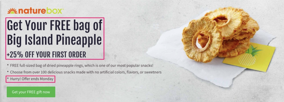
- Create a sense of urgency: Adding a deadline (or even a live timer) to an offer will subtly push users to claim it right away. Your goal is to snag a second conversion ASAP—to build a habit to continue doing business with you. Customer loyalty is a fragile thing nowadays.
Source: Sleeknote
Naturebox nails this strategy. If you create a membership for its snack box service, you receive a free bag of dried pineapple rings, plus (and more importantly) 25% off your first order. But there’s a catch—the offer ends Monday. With this added pressure, Naturebox gives the users no time to talk themselves out of it. And just like that, their thank you page scored them more conversions.
-
Upsell or cross-sell a product or service
Did you know that once users opt in and convert, the odds of selling to them drastically increase? While the probability of selling to a new prospect is 5-20%, the probability of selling to an existing lead is 60-70%.
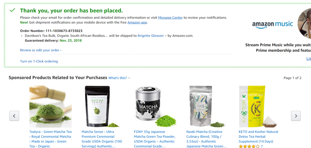
Once you score that first conversion, you also score information on your customers. If you snag a sale, you start learning about their tastes and what type of related products you should promote. And just like that, your thank you page becomes an organic place to upsell or cross-sell and score those easy conversions.
Do you know who does this well? Amazon. In fact, 35% of all Amazon purchases come from upsells and cross-sells.
Source: CXL
You may think that upselling or cross-selling is an aggressive tactic. (“Seriously, you’re hounding me for another sale already?”) However, users seem to find it quite the opposite.
According to Forbes, 91% of consumers are more likely to shop with brands that provide offers and recommendations relevant to them, and 74% of users are frustrated when they come across website content that isn’t personalized.
It sounds like you’ve got the green light!
-
Incorporate social proof
Your thank you page is also the perfect spot to incorporate social proof and eliminate buyer’s remorse, which is the feeling of regret after making a purchase. We’ve all been there. We’ve bought a pair of shoes we didn’t need, subscribed to an expensive food delivery service out of laziness, and thrown down our email for a giveaway we probably won’t win—and then looked for ways to get out of it.
Incorporating social proof on your thank you page reminds customers of your value—why they converted in the first place and why they should stick around.
Social proof is based on the idea that people follow the actions of others. Examples of social proof are customer testimonials, reviews, features, endorsements, and credentials. Think about the last time you were exposed to a new brand that interested you—did you make a purchase right away? Or did you spend hours researching them first? Social proof is important because it acts as a seal of approval for your brand.
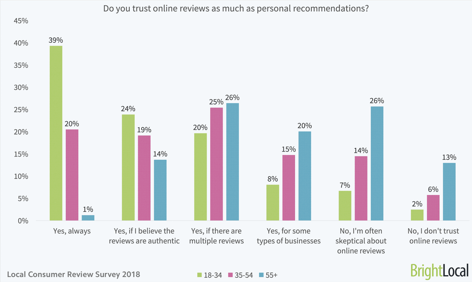
If your audience is between 18-34 years of age, online reviews are particularly beneficial for your thank you page. The following graph indicates that 91% of consumers in this age group trust reviews as much as personal recommendations!
Source: Search Engine Journal
Perhaps your older customers won’t be wooed by star reviews. But there are other forms of social proof you could leverage. Do you have any awards, credentials, or certifications you could draw attention to? Any endorsements from industry experts or features in the media that you could mention? Social proof comes in all shapes and forms—but the underlying goal should always be to authenticate your brand and demonstrate its value. People love it—and so should your next customer.
By the way, your thank you page is not the only page that could benefit from social proof. Read about how it improves the performance of landing pages here.
-
Link to high-performing, related content
When designing a high-converting thank you page, you also have to think about your long-term strategy. How can you keep your customers actively engaged with your brand? Because if they’re engaged, they’ll continue to convert.
One way is to connect them to high-performing, related content. This content could be ungated (accessible without filling out any forms), such as blogs, infographics, videos, and case studies. Or, it could be gated (accessible after filling out a form), such as downloadable white papers, ebooks, and reports.
In this thank you page by Salesforce, they don’t promote their paid services at all. But it links to free, related resources to emphasize its value to users, which is hugely important for building trust and loyalty.
Source: Manage Inbound
People don’t like to be sold, but they like to buy. Connecting your users to free, personalized content is a great way to demonstrate that you’re not just there to sell things. And by doing that, they’ll probably spend more with you down the road. (Is this how reverse psychology works?)
Charity Water’s thank you page, shown below, provides donors with links to a related blog post, but they also link to their store. By pinning them side-by-side, they soften the upsell and get their donors spending more. (Hey, it’s for a good cause!)
Source: Cause Vox
-
Encourage social shares
Adding social sharing buttons on thank you pages is a little feature that goes a long way. First, it encourages community-building and engagement, which, again, builds trust and loyalty with your current customers. Second, it increases brand awareness and visibility—with the click of a “share” button, your product is exposed to many like-minded potential customers.
To maximize your social engagement, here are a couple of suggestions:
- Research your audience, pinpoint their favorite social channels and push for social shares on that platform. Examples are Facebook, Twitter, Instagram, and Pinterest.
- Incentivize your customers to share. Offering gifts and discounts in exchange for referrals is a great way to encourage social shares. As you can see below, creating giveaways is another option to stir up some interest to engage.
Thank you for optimizing your next thank you page
Really, it gives us great pleasure knowing that you’re leveraging your thank you page to score more conversions. Sprucing it up with some relevant content, links, and discounts keeps the marketing funnel going—and turns fresh new faces into longtime customers.
If you’d like to chat more about your growth marketing strategy, we’re all ears. (I’m downplaying it—we’re SO pumped to geek out about growth hacking!). Reach out to us anytime!

Ayesha Renyard
Content Writer @ Galactic Fed


